“Let’s build a dashboard exploring any correlations in weather and crime.”
- Jack Temme, Mckinley Card, Kathryn Reese
Layout Design
Before
Psychedelic density map
Placeholder graphs not yet connected to API and javascript
No color harmony
After
Title and explanation introduce the dashboard
Interactive elements in the same frame as map
Color palette and visual hierarchy through contrast
Scroll bar for further exploration and dynamic graphs
Density Mapping
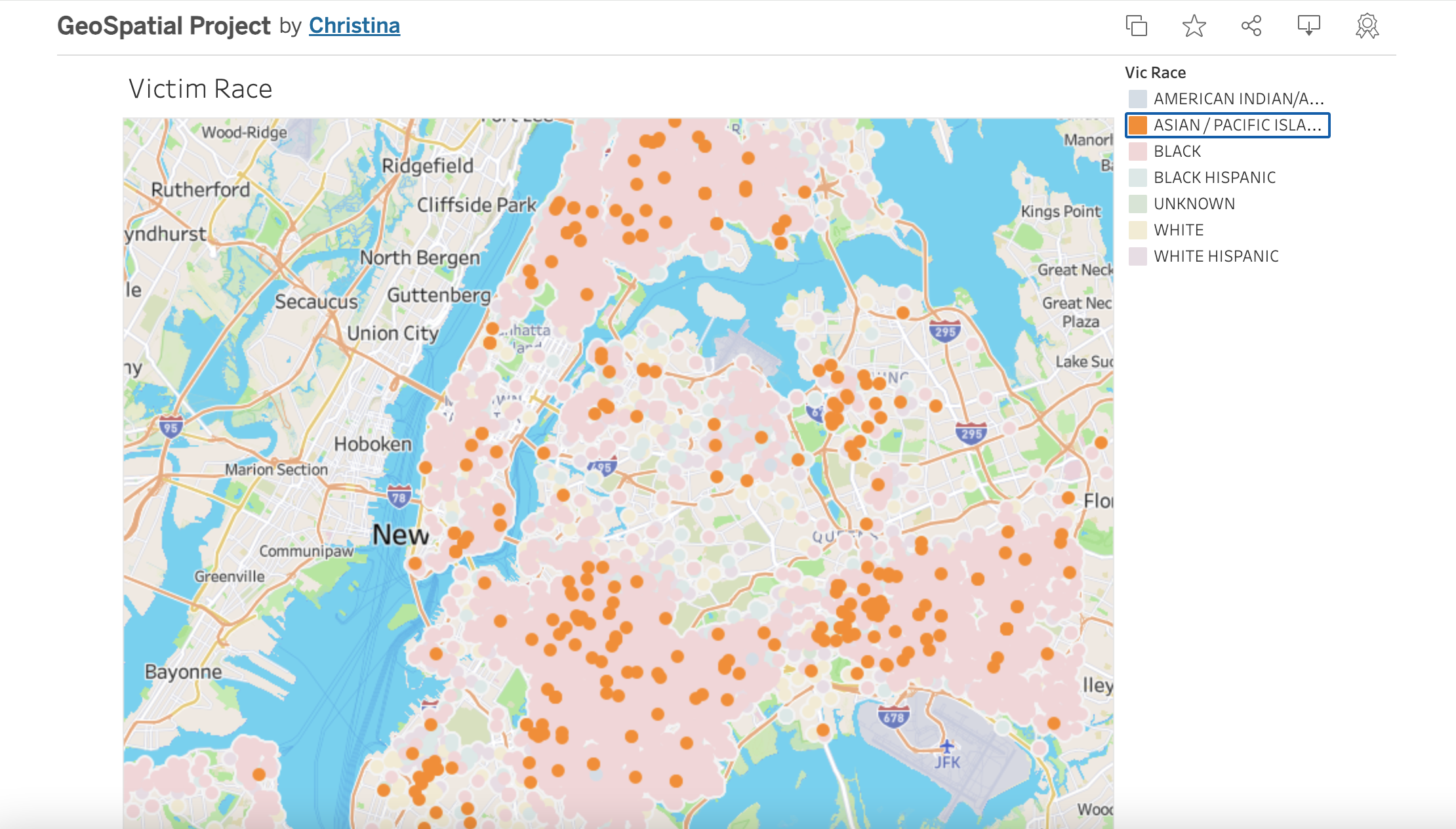
Density maps can look gross like a crawling hill of ants or mold growing if done poorly
Maps can also be misunderstood if colors are too similar to representations of heat or light
We opted for a moderately blurred map that would highlight patterns over individual incidents


